It has been a little while since we took a good look in the mirror at DOAJ – we have had our heads down, working hard to update the technology and website which deliver the DOAJ services that you know and love. But as the world started to emerge from various lockdowns and we too looked up to plan for this year and beyond, one thing was clear – it was time to finish up on that new look we have been planning.
We had already made big steps forward in our user experience improvements and re-launched the DOAJ website in November 2020. Now we wanted to complement this with a new visual identity, something that reflected our place in the world, our values and our commitment to open access for all.
We brainstormed – what is DOAJ now and what do we hope it will be in the future? Words came up, we wrote them down– growth, quality, openness, information ecosystems, information flows, resources, knowledge, sharing, learning, natural, interlinkages, honest, reliable, international, local.
But how to reflect this graphically? Thankfully we didn’t have to start from zero, we had already changed and updated much on our website, deliberately leaving our logo plain black and white, something we knew we could accessorise later on.
Our journey began in familiar territory – orange – the colour traditionally reserved for all things open access. After some work, a new shade emerged – Sanguine and grapefruit – like the ‘open access orange’ but with a twist.
This was a good start but we wanted more – something to express our personality further. In keeping with our ideas related to natural flows of information, growth, knowledge and information ecosystems, a more natural palette surfaced with dynamic shades of greens and a golden yellow. We already had our black and white basics, the new colours now allowed us to add a bit more pizzazz to the DOAJ look and feel.

Equipped with colours, we moved on to graphics, still keeping those key words and values at the forefront of our mind.
We considered and revised lots of different proposals, many were rejected until a favorite emerged. The team agreed that we had found a visual identity representative of DOAJ now and for the future. Our new look was finalized.
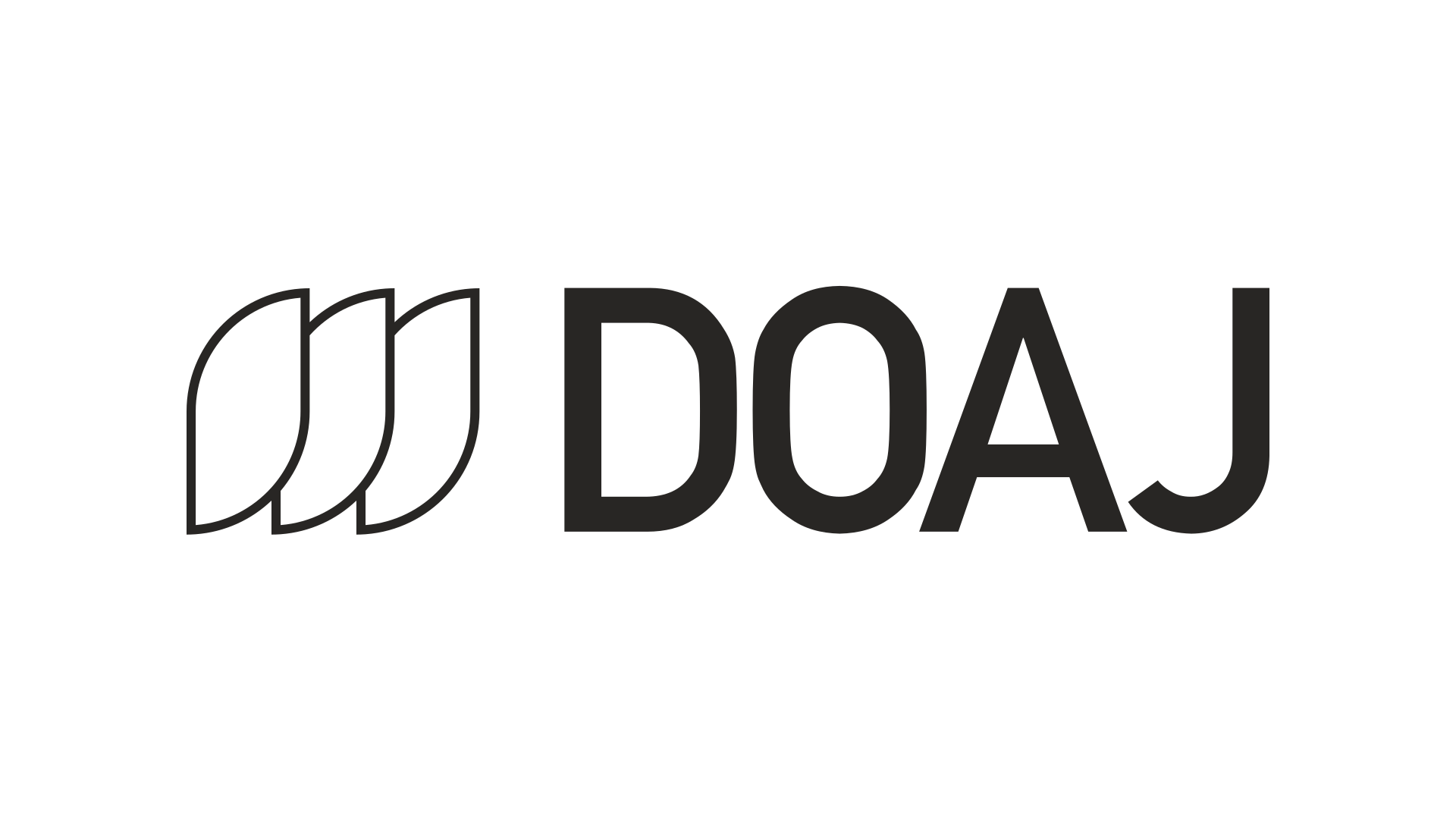
Meet our new logo… The three leaf shapes represent the evolution and growth of DOAJ, yet they retain a sequence, a nod to our core activity, indexing quality open access journals.

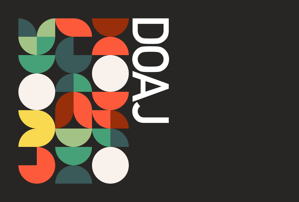
But that’s not all. DOAJ indexes journals from all over the world in multiple languages, fields of study and publishers of all different sizes. We wanted to express our individuality and our commitment to inclusivity and diversity. In this spirit, we designed a range of patterns to use in our future communications, all inspired from our journey through DOAJ’s visual identity and values.


We hope you will like them as much as the DOAJ team does…
Let us know your thoughts!

There is far too much white space on this site thanks to the new redesign. Not fun to read on a mobile.
Hi Therese,
Thank you for your feedback. I am Sophy, DOAJ’s sole UX/UI Product Designer. We try to use whitespace, especially on desktop, to aid reading for our users. I admit that we focus a lot more on the desktop side of things due to the vast majority of our users being on larger devices.
However, the design is, like the entirety of our platform, an evolving work in progress. Most users won’t notice it, but we make changes to the website on a near-daily basis, often changing tiny details such as this. I will take into account restraining the use of whitespace on mobile when prioritising our multiple other development and design tasks.
Sophy