This is a guest post by Sophy, our UX Designer.
Accessibility has always been a top priority in doaj.org’s redesign project, along with improving:
- user experience,
- navigation, and
- responsiveness on various devices, browsers, and operating systems.
We approached the project with the idea that accessibility, as opposed to branding and visual design, is foundational to all of these elements.
Why accessibility-first?
DOAJ is a platform and organisation with a global reach and a highly diverse audience: it indexes 15,100+ journals, from 134 countries, covering 80 languages. It is therefore essential that our design and user interface strives for inclusivity.
We mostly think of web accessibility (abbreviated to a11y) as best practices that make a website usable for people with visual disabilities. This often omits the needs of those with speech, motor, and cognitive impairments. Accessibility not only includes users with lifelong disabilities but also users affected by environmental or otherwise temporary circumstances (e.g. using a device with a smaller screen on a slower network).
Good a11y certainly shows consideration for disabled users. As an added benefit, its implementation has been shown to:
- Boost SEO and content discoverability with semantic HTML;
- Improve the site’s performance and speed by reducing reliance on Javascript and CSS for functionality; and
- Improve maintainability and reduce design debt through a simpler and more consistent user interface.
Automated testing tells part of the story
As a starting point, we looked to implementations of the Web Content Accessibility Guidelines (WCAG). Using tools like Lighthouse audits and Accessibility Insights for Web, checklists implementing WCAG 2.1 AA’s guidelines are simple to follow.
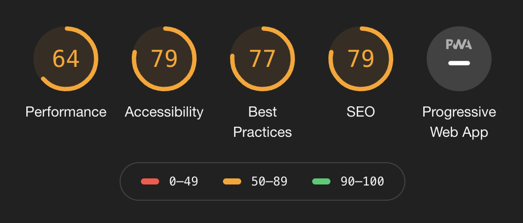

One of the most common errors for over 85% of the top 1,000,000 home pages is low-contrast text, an easily-detectable barrier for users with colour vision deficiencies (CVDs). DOAJ’s current colour palette does not pass automated colour contrast tests for text and background, so we revised it and opted for a softer and more restrained palette that follows WCAG’s contrast requirements. We want to be more thoughtful in our use of colour, reserving DOAJ’s orange for important calls-to-action only.

On the right: preview of the new site’s application form using these combinations.
As a result, we updated the orange-on-white horizontal logo and made a slight adjustment to the text. The cleaned-up DOAJ logotype uses the same typeface as the old one, but with a bolder font-weight and adjusted kerning. This version is now more flexible as it can be used in different contexts, and on both dark and light backgrounds:

The next three most-common a11y errors all concern the correct use of HTML markup: missing alternative text for images, empty links, and missing form input labels. A good part of DOAJ’s redesign included rewriting our page templates to:
- use semantic HTML tags and accurate WAI-ARIA roles as much as possible
- better organise content both visually and hierarchically (
<h1>through<h6>) - reduce markup complexity and gradually remove meaningless HTML elements (also known as divitis due to the overuse of
<div>tags) unless it is used for styling purposes
Inclusivity concerns influenced some design choices
We mentioned earlier that DOAJ contains journal and article content in 80 languages, so we made sure that our new typefaces could support as many different languages as possible for displaying text in different scripts and special characters. Other considerations included:
- Open source status of the fonts, in keeping with DOAJ’s open source and open access mission
- Suitability for text-heavy web content, in particular, long scholarly article titles
- Personality of the typeface: unassuming, yet functional
- Font legibility, based on characteristics like larger x-heights and wider characters
As for text readability, we have been revising our content to use Plain English so that we can better serve users for whom English is not their first language.
Qualitative user research and historical usage data gave a broader perspective on design issues
Automated testing scores are not the only indicators of accessibility. As with user experience, we know that a11y can’t simply be condensed into a to-do list of technical requirements. This is why we conducted live, moderated usability tests of the new application form followed by interviews with real DOAJ users; these tests have helped us determine specific pain points when filling out the form and further refine our design.
We also conducted a card sorting exercise with users to improve our site structure and optimise website navigation and content findability. We used card-sorting software to visualise clusters of information (i.e. pages of the site) that were categorised together by our testers:
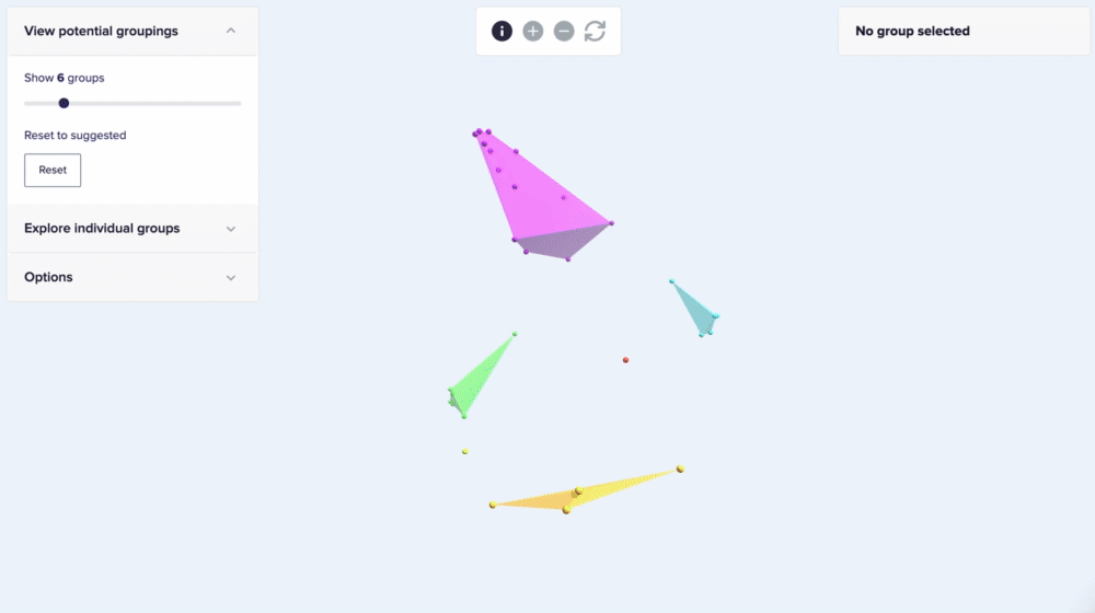
Each label represents a single web page.
Our findings helped us flatten and simplify the site’s content hierarchy, hopefully making it easier for users to find what they are looking for, whether it is a journal’s metadata, technical documentation, or guidelines on how to apply to DOAJ.
Our approach combined user testing with qualitative data gathered from the live website. Google Analytics helped us quickly analyse traffic and behaviour to understand how our users navigated from one page to another. Using Hotjar, we also visually prioritised information on every page based on real users’ cursor movements on the current site:

The current site places the search bar, the most clicked area on this page, on the right. This could be unintuitive for a majority of our users who read in languages with left-to-right scripts.
User experience improvements will not end with the new website launch
We know things might not be perfect when we launch the website: some features have changed and some might not work as expected. You will be able to report or give feedback on website-related issues.
We are committed to continually improving the user experience of DOAJ’s platform in the long term. For example, we’re looking at further usability testing, including unmoderated ones, as well as testing with self-identified disabled users and multilingual users; we’re planning on translating the website into French; and we’re currently working on our accessibility statement to clarify potential a11y issues with the site.
Please leave your thoughts in the comments. We welcome your feedback.